It’s no secret that colors hold immense power. They can evoke emotions, influence perception, and leave a lasting impression.
And, when it comes to branding your business, color theory plays a crucial role in creating a memorable brand identity.
So, how do you incorporate color theory in your brand identity?
Knowing how to read a color wheel and understanding basic color schemes is just the first step.
In this blog, we’ll explore color psychology, examining how different colors can shape how your brand is perceived. By the end of this blog, you’ll be ready to make color choices that will propel your brand identity forward.
Key Principles of Color Theory
Understanding the fundamental principles of color theory empowers you to make informed decisions about your brand’s color palette.
Let’s begin by delving into the essential building blocks:
Primary, Secondary, and Tertiary Colors
The color wheel serves as the foundation of color theory. It’s a visual representation of the relationships between colors. There are three primary colors: red, yellow, and blue. These colors cannot be created by mixing other colors. But by combining them in various proportions, we create secondary colors: orange, green, and violet. Further mixing of primary and secondary colors results in tertiary colors, offering a wider spectrum to choose from.
Color Harmonies and Relationships
The color wheel also helps us identify harmonious color combinations that create visually pleasing effects. Common color harmonies include:
- Complementary colors: Located directly opposite each other on the wheel (e.g., red and green). These create a high-contrast and energetic feel.
- Analogous colors: Sitting next to each other on the wheel (e.g., blue, blue-green, and green). They create a sense of calmness and coherence.
- Triadic colors: Three colors spaced evenly around the wheel (e.g., red, yellow, and blue). They offer a vibrant and dynamic feel.
Warm and Cool Color Tones
Colors can also be categorized as warm or cool. Warm colors (red, orange, yellow) evoke feelings of energy, passion, and excitement. Cool colors (blue, green, purple) are associated with calmness, trust, and professionalism. The strategic use of warm and cool tones can influence the overall mood and perception of your brand identity.
 Psychological Impact of Colors on Branding
Moving beyond aesthetics, color theory delves into the fascinating realm of color psychology. Here, we explore how different colors evoke emotions and create associations that can significantly impact your brand identity.
Emotions and Associations Linked to Colors
Colors have the power to trigger a range of emotions and subconscious associations. Here’s a glimpse into some common color perceptions:
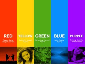
- Red: Associated with energy, excitement, passion, and urgency. Ideal for brands aiming to convey boldness or inspire action.
- Blue: Evokes feelings of trust, security, reliability, and peace. A popular choice for brands that emphasize professionalism and stability.
- Yellow: Represents optimism, happiness, creativity, and intellect. Well-suited for brands promoting innovation or youthful energy.
- Green: Linked to nature, growth, harmony, and balance. A great choice for brands focused on sustainability or a sense of well-being.
- Purple: Often associated with luxury, sophistication, wisdom, and creativity. Can elevate a brand’s image and convey a sense of regality.
Remember, these are general associations, and the specific impact can vary depending on the context and cultural background.
Cultural Variations in Color Perception
Color meanings can also differ across cultures. For instance, in Western cultures, white symbolizes purity and innocence, while in some Eastern cultures, it’s associated with mourning. It’s crucial to consider your target audience’s cultural background when choosing your brand colors to ensure your message resonates effectively.
 Choosing Your Palette: Building a Color Scheme for Your Brand
Now that you’re armed with the knowledge of color theory and its psychological impact, it’s time to translate that knowledge into action. This section dives into the process of crafting a cohesive color scheme that embodies your brand identity.
Steps to Create a Cohesive Color Scheme
Building a successful color scheme involves careful consideration:
- Define your brand identity: Reflect on your brand’s core values, target audience, and the overall message you want to convey. This foundation will guide your color choices.
- Research your industry: Analyze the color palettes commonly used by your competitors. Consider how you can differentiate yourself while remaining relevant within your industry.
- Utilize color psychology: Leverage your understanding of color associations to choose colors that resonate with your brand’s desired emotions and perceptions.
- Experiment with color harmonies: Apply the principles of complementary, analogous, or triadic colors to create a balanced and visually appealing palette.
- Test and refine: Don’t be afraid to experiment with different combinations. Evaluate your options on various marketing materials to ensure they translate effectively across platforms.
Tools and Resources for Color Palette Creation
Several tools and resources can make crafting your brand’s color scheme a smooth process:
- Online color palette generators: Tools like Adobe Color (https://color.adobe.com/) allow you to explore different color harmonies and experiment with variations.
- Design software: Graphic design software like Adobe Photoshop (https://www.adobe.com/products/photoshop.html) or Canva (https://www.canva.com/) offer advanced color selection tools and palette creation functionalities.
- Color inspiration websites: Websites like Pinterest (https://www.pinterest.com/) or Design Seeds (https://www.design-seeds.com/) showcase beautiful color palettes that can spark inspiration and guide your choices.
Remember, the best color palette is unique, memorable and aligns perfectly with your brand’s essence. Use these tools to explore your options and create a palette that sets your brand apart.
Bringing Your Brand to Life: The Power of Color

Color transcends aesthetics. It’s a branding superpower, shaping recognition and forging emotional connections.
A strategic color palette breathes life into your brand. Imagine a brand consistently using bold red and calming blue. Over time, those colors become synonymous with the brand itself—red symbolizing action, blue signifying trust. This is color recognition in action.
Think of iconic brands—Nike’s vibrant red swoosh and IKEA’s refreshing blue and yellow. These palettes create instant recognition and a strong visual presence.
But color goes beyond recognition. It fosters emotions. Warm colors like orange and yellow evoke warmth and optimism, while cool colors like green and blue promote tranquility. Understanding these associations lets you tailor your palette to elicit the desired response.
A children’s brand might use playful brights for joy and excitement, while a financial services company might choose blues and grays for stability and trust.
Color theory allows you to create a brand that’s not just visually distinct, but emotionally connected with its audience. It’s the difference between being seen and being felt.
Conclusion
By understanding color theory and its impact on brand perception, you’ve gained valuable knowledge to elevate your brand identity. Remember, a well-chosen color palette can be the difference between blending in and standing out.
Ready to harness the power of color for your brand?
Contact us today to learn more about how we can help you create a cohesive and impactful visual brand identity.
We can help you translate your brand vision into a strategic color scheme that resonates with your target audience.