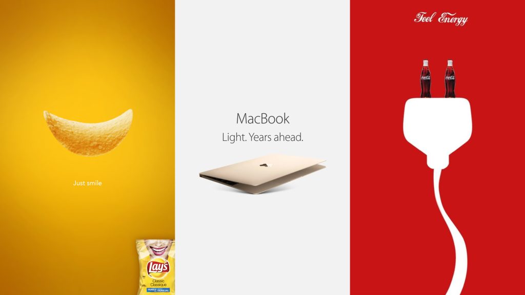
Minimalist graphic design has been gaining popularity for its simple, clean and impactful aesthetic.
And businesses and marketers all over the world have started to take otice.
By embracing a “less is more” approach, minimalist design can effectively communicate a message while creating a lasting impression.
But what exactly is minimalism in graphic design and why does it matter?
Today, we’ll discuss why minimalism is a game-changer in modern graphic design and how to use it to increase engagement.
D efining Minimalism in Design
(image: minimalistic graphics)
Minimalism in graphic design means using a minimal amount of elements to convey a message and eliminating the rest.
In other words, it’s about using only what is needed to make a clear and powerful message.
And consumers have started to prefer this aesthetic.
In a world filled with constant information overload, minimalist design stands out and captures attention.
It creates a sense of calmness and simplicity while still being visually appealing.
So, should you jump on the minimalist bandwagon for your brand’s design?
Here are ten reasons why you should consider it:
10 Reasons to Embrace Minimalism
1. Enhances visual clarity
In minimal graphic design, simplicity creates visual clarity. It’s important to use clean lines, ample white space, and minimal colors to encourage a more focused and purposeful approach.
This allows your audience to direct their attention to only the most important elements.
2. Reduces unnecessary clutter
Cluttered designs can be confusing. It’s essential to remove unnecessary elements that might distract your audience. Instead, embrace negative space so the main point can stand out.
This not only allows the design to breathe, but also makes it easier for your audience to understand the information being presented.
3. Focuses on core brand messaging
By focusing on the basics, you can clearly and effectively communicate what your brand is all about. It emphasizes the most important elements of your brand, making it easier for users to understand and remember.
Simple and clear design reinforces brand consistency and increases brand recognition by creating a memorable and impactful experience.
 4. Improves audience engagement
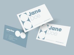
(image: minimalistic business cards or website)
Distracting elements on a design can take away from the main message and decrease audience engagement.
By simplifying the design, you are able to create a stronger connection with your audience.
Think about minimalistic graphic designs, such as those seen in business cards or websites. This intentional simplicity makes the design easier to understand and remember.
The easier it is for your audience to navigate and absorb your design, the more engaged they will be.
5. Timeless aesthetic
Minimalist designs are a smart long-term choice. The clean and uncluttered look ensures that your website maintains a contemporary appeal, even as design trends evolve.
This not only reduces the need for frequent redesigns but also helps establish a strong and consistent brand identity.
By choosing a minimalist approach, you invest in a design that will resonate with users for years to come.
6. Versatility across platforms
To put it simply, minimalist designs look good on all kinds of devices and media.
This adaptability makes your website more accessible and user-friendly, whether viewed on a smartphone, tablet, or desktop.
The clean and straightforward aesthetic also translates well across various media, maintaining visual appeal and functionality regardless of the context.
7. Reduces cognitive load
Minimalism makes information easier to process. This helps viewers understand and remember your message better. By presenting only essential elements and avoiding unnecessary clutter, minimalist design ensures that users are not overwhelmed.
This streamlined approach enhances focus and comprehension, making it easier for users to engage with and retain the content. As a result, your message becomes more impactful and memorable, improving overall communication effectiveness.
8. Faster development and iteration
The simpler a design, the quicker it is to create. Modern minimalistic designs use fewer elements and simpler layouts, which reduces development time and allows for more rapid iteration.
This efficiency not only accelerates the launch of your website but also facilitates easier updates. This means you can easily implement modifications in response to user feedback or market changes.
9. Simplifies navigation and user experience
Nowadays, first impressions matter more than ever.
A minimalist web design enhances the customer experience by providing a faster, more searchable website. Simplifying navigation is key.
Clear website layouts with simple UI/UX design allow users to find what they need quickly and intuitively. Additionally, this simplicity makes it easier for search engines to crawl and index your site, improving your brand’s online optimization.10. Aligns with sustainable design trends
Less really is more when it comes to minimalism. A rule of thumb is to avoid excessive elements and use fewer resources to reduce design waste.
This approach supports environmentally friendly practices and appeals to an eco-conscious audience.
Showcasing Minimalism in Action: Examples & Inspiration
Many successful branding and marketing campaigns can be seen across various industries. For example, Apple’s product designs and advertisements are known for their minimalist approach, focusing on sleek lines and essential features.
Another example is branding of Muji, a Japanese retail company that emphasizes simplicity and functionality. These examples show how minimalism can effectively communicate brand identity and message.
Tips for Implementing Minimalism
To use minimalism in your designs, start by focusing on the basics. Use a few colors, lots of empty space, and simple fonts. Limit your color palette to a few contemporary colors. If minimalism seems too plain, add interest and depth with textures, contrasts, and bold colors.
Conclusion: The Enduring Power of Minimalism
Minimalism’s power in graphic design lies in its clarity and timeless appeal. By adopting a minimalist approach, you can improve your brand’s communication and connect better with your audience.
Ready to embrace minimalism in your designs?
Contact us today to start increasing your business’ searchability and customer experience through minimalistic design.

 4. Improves audience engagement


